6 ways to visualize your Twitter stream
 Tuesday, January 12, 2010 at 3:50PM
Sometimes you need a visual aid to get your head around what’s happening on Twitter
Trying to explain Twitter in a presentation or grasp how popular a keyword is can be tricky. Fortunately, there are several sites that show what’s happening on Twitter in a fun, visual presentation. They can strengthen your presentations by illustrating how Twitter works or make a more compelling event by dynamically showing people what’s being tweeted about.
I sat down with my co-workers and created a wish-list of qualities that we as marketing people want in an Twitter visualization tool. As usual, all the tools have to be free. Beyond that, we wanted to be able to:
- have an easy-to-use interface
- get the hang of it quickly
- stream tweets based on keywords
- easily configure it
- make our tweets visually interesting
- have adjustable settings
The evaluation method was simple. I visited each site and registered. After my profile loaded, I took a screenshot of the interface and then spent about ten minutes looking around the site. A decent site should be able to explain itself in that time. After using the application, I rated each site against my wish list.

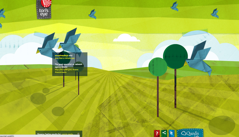
Tori’s Eye takes an origami approach to Twitter visualization. The site is highly visual and easy to use. Enter the word you want to track and watch the blue birds float by as the occasional cloud passes in the background. You can see what tweets are wafting by by holding your cursor over the bird. You get the Twitter account name, a link to their profile, when it was said and the tweet.
PROS:
Easy to use and very visual.
CONS:
No features outside of the ability to search on a word. It would be nice to see tweets maybe trailing behind the birds instead of having to click on the birds to read the message.
Twittospheric works the same way as Tori’s Eye. You enter a keyword and the site searches Twitter for the results. Except it doesn’t work very well. Initially it looks impressive. The Twitter bird slides past the screen and the user profile image appears, a link to the tweeter’s profile and their tweet appear in a little box. When you do a search, it appears to break the site. The birds still fly by but they no longer display any tweets.
PROS:
Easy to use and visually interesting
CONS:
Once you add a search word, the site quits working. I waited for about 20 minutes and then moved on. It went into a search mode but never displayed anything again.
TwitterMotion is an interesting concept done horribly wrong. It presents the tweets in an interesting way. You enter your Twitter name and password, then your tweets fly by in oversized text. Initially it looks quite fun but then you realize that you can barely read the tweets as they fly by. It’s worth looking at once but the gimmick wears thin quickly.
PROS:
Visually interesting way to display your tweets.
CONS:
Hard to read and understand what you’re looking at.
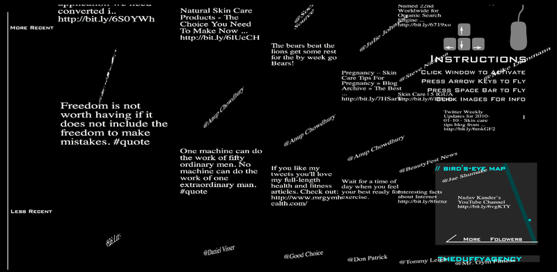
Twitt3D this black and white site is visually interesting but difficult to use. After logging into the site, it displays the most recent tweets from your followers in a 3D block. Focusing in on a tweet takes a bit of playing with to get the hang of. The tweet shows up on the vertical plain, while the tweeter is on a 90 degree perpendicular angle. There is also something called a Bird’s Eye Map but I never figured out what it was for.
PROS:
Visually interesting and fun to play with.
CONS:
Difficult to understand how it works or what you’re looking at. Once you submit your Twitter username and password, it runs its search and then never updates again. I’m not sure what the point of the site is except to present tweets in a convoluted fashion.
Twittearth is a cute view of the world with little monsters representing tweeters in different parts of the world. As new tweets appear, the globe spins to show where in the world the tweet is coming from. It takes a random sampling of tweets to display. You can login to your Twitter account to display the tweets in your Twitter stream but it appears to be broken as I could never login.
PROS:
Simple and fun to use. Watching the world spin around as new tweets pop up is fun to watch.
CONS:
It’s worthless if you can’t control it. You can’t login to display your Twitter stream and you can’t enter a keyword to track.
Twitterfall is the most adaptable site. You can select a current trend, a list, do a search, or show tweets based on geolocation. As each tweet appears, you can DM, follow, retweet, reply and more. They also give you customizable setting such as speed at which new tweets appear, the fall size, language selection, text size and more. It’s a great site with lots of features to make it more useable.
PROS:
Despite having a ton of features, the site is simple to use and easy to understand. The waterfall effect as new tweets appear keeps new tweets easy to read.
CONS:
You have to refresh the page to get new searches to work sometimes. Not very visually exciting.
CONCLUSION: The clear winner here would be Twitterfall. It’s not the most creatively visual, that would be Tori’s Eye, but it offers the most features and customizability with six different ways to change your viewing experience. Nothing else even comes close...or works. How do you like to see Twitter visualized?
Stefan Halley is the Digital Project Leader for The Duffy Agency. He loves to talk about social media and won't shut up about Twitter.
Download the Slideshare version of this blog post.


Reader Comments